About Foundation:
Foundation was a family-owned and operated, community-minded coffee shop and restaurant founded in 2013 in the heart of San Francisco’s Financial District. We offered a gourmet California dining and espresso experience in an approachable, quick service setting – ethically focused on seasonality, sustainability, nutrition, and value to our patrons.
Our mission: to provide a beautiful, vibrant, and welcoming environment that served a health conscious product crafted with integrity – made from fresh and locally sourced ingredients. Foundation was a safe space. We took pride in welcoming every race, sexual orientation, and gender.
In 2021, Foundation was set to expand further – to become one of the first businesses within SOMA’s Salesforce Transit Center. In addition to our unique menu, the new Foundation would feature a full bar, a modern interior design and custom build-out, original cocktails, and homey California-Filipino themed bar bites inspired by our family’s recipes.
Due to the lasting effects of the COVID-19 pandemic, we made the difficult decision to close our operations permanently in August of 2020. That said, I’m proud of the work I contributed to Foundation’s rebranding effort, and excited to share some of it below.
My contribution to the rebranding initiative included design/art direction, conceptualization, design mark selection, project management, and copywriting.
About the Mark – copy
The story begins on San Francisco’s Kearny Street – which was historically named “La Calle de la Fundacion” by the Spanish, and translates to “street of the foundation.” When we set about the basis of our rebranding and creating this mark during an important expansion, we visualized our own support system – our foundation – and the inspiration that started this business: Family. Art. Diversity. Counterculture. Community.
In many ways, San Francisco has seemingly lost sight of these principles it once deeply valued – that flourished throughout the City’s neighborhoods. The challenge was to create an artistically striking, modern, and bold mark that effectively embraces its oddities: The letters are made up of different typefaces, styles, weights, and visual elements. They’re all welcome here. Once combined, they provide an art-forward aesthetic and a creative energy. A sense of belonging and strength. A nod to San Francisco’s artistic roots.
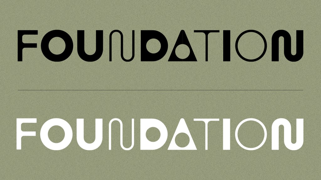
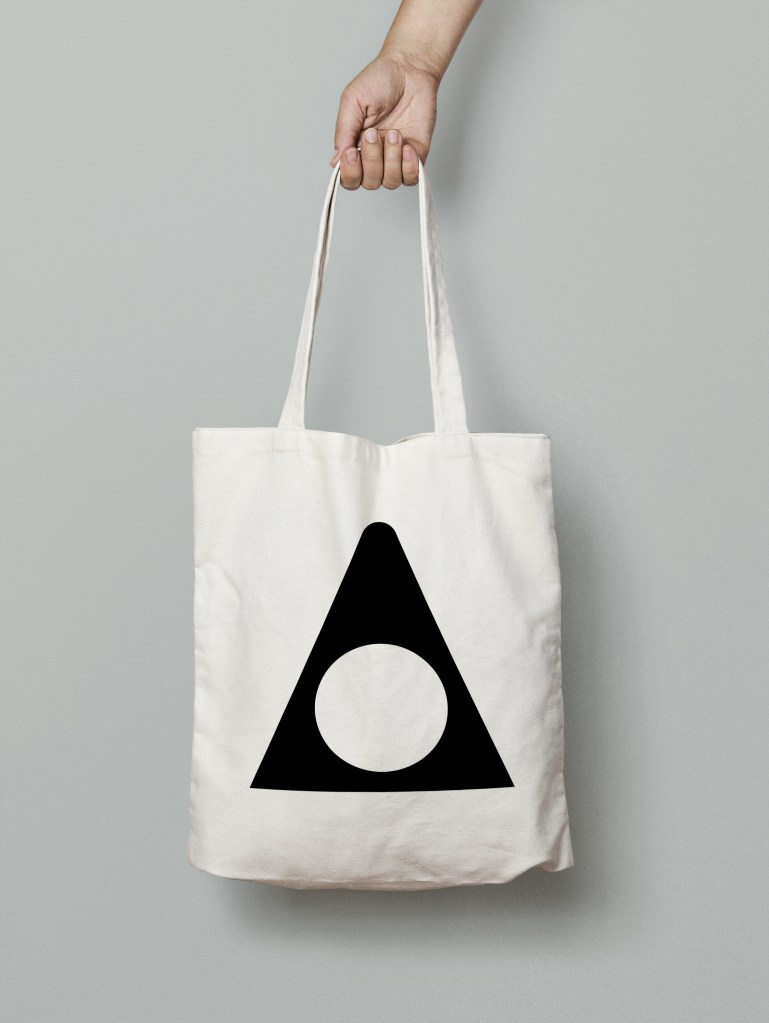
Foundation Rebrand – Logo/Mark
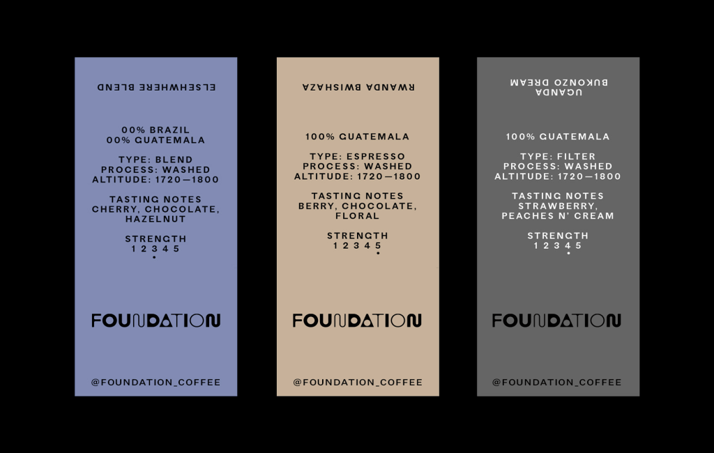
Coffee Labels